CNET.com
Designing for a pioneering internet company in the pre-Y2K era was an exciting time, at least until the dot-com crash happened. As a top worldwide provider of tech information, CNET Networks had the budget to support some intense creative projects. One of these projects even won an Outstanding Graphic Design & Art Direction Emmy Awards for my team and me! AN EMMY!


print / design / production / logistic / 1999
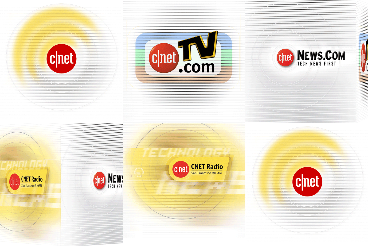
”Daytime-always” is the reason why CNET’s corporate branding was shining in bright yellow — signaling the internet does not go dark.

branding / design collaboration / production / 2001
Within a short period of time, CNET had expanded from an online information portal to a multimedia giant including radio/online shows production. In fact, Ryan Secrest was sitting a few yards away from me, his career started at CNET Radio in San Francisco.

print / creative direct / design / production / logistic / 2001
Long before Google retro-created its own mother company — Alphabet Inc. for itself and all the subsidiaries, CNET had established CNET Networks to do the same, the umbrella company included News.com, TV.com, CNET Radio, and The New Edge.

print / design collaboration / production / logistic / 2000
The utter super fancy notebook printed with spot UV and special die-cut was memorandum marketing piece given out to clients and employees.

print / design collaboration / production / logistic / 2000
Following the previous year success of the marketing notebook, another utter super fancy notebook was designed and given out to clients and employees with new look and feel.

print / design / production / logistic / 2001
Translucent plastic cover printed with 3 spot colors, backed with an aluminum spine and backboard, this is probably the substantial folder I have designed.

print / design / production / logistic / 2000
This mini brand guide/factbook was a take away marketing piece for vendors and clients. Although it’s in a handy and mini size, it surely did not fall short in budget with those custom pages of specified Pantone color chips.

print / creative direction / design / production / logistic / 2000
The City Hall building in the heart of San Francisco held CNET’s annual employee celebration in the new millennium. A ½ set of string symphony (30 well-dressed musicians) was standing along the center stairwell greeting the event with modern tunes. It was dramatic and extravagent reflected the cool design of the ticket design. Almost 20 years later, it still looks fresh, timeless design I must say.

print / creative direct / design / production / logistic / 2001
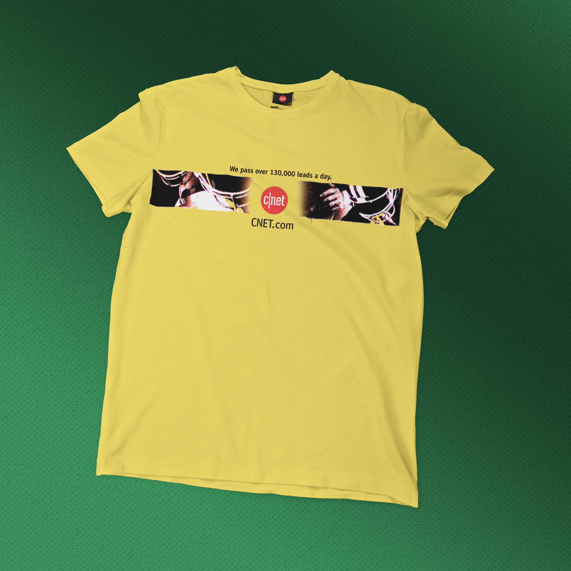
No sports clunky typography, chic and modern was the team we were playing for.

It was an out of body experience for a junior designer to get involved with an Emmy winning project. I am grateful.


print + digital / creative direct / design / production / logistic / 1999
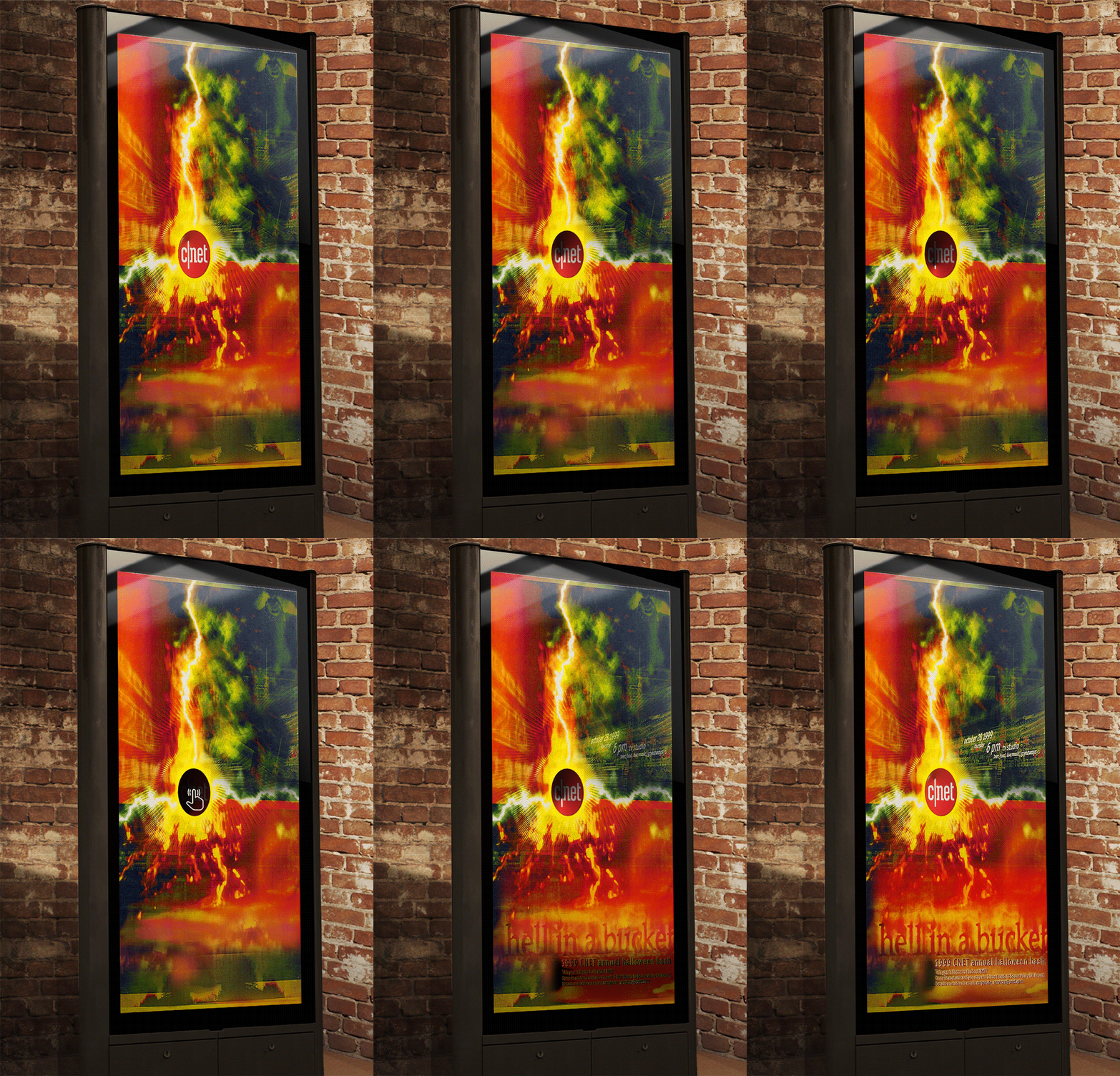
Welcome to the future beyond the Y2K — a Halloween celebration event poster on a touchscreen kiosk.


